The brief
The brief Was to redesign the book cautionary Tales for children and tailor it to adults. This was a team project, where I took on the role of layout designer/ secondary typographer. I chose the font of the body text and ensured that the typography and illustrations worked well together on the page.
Inspiration
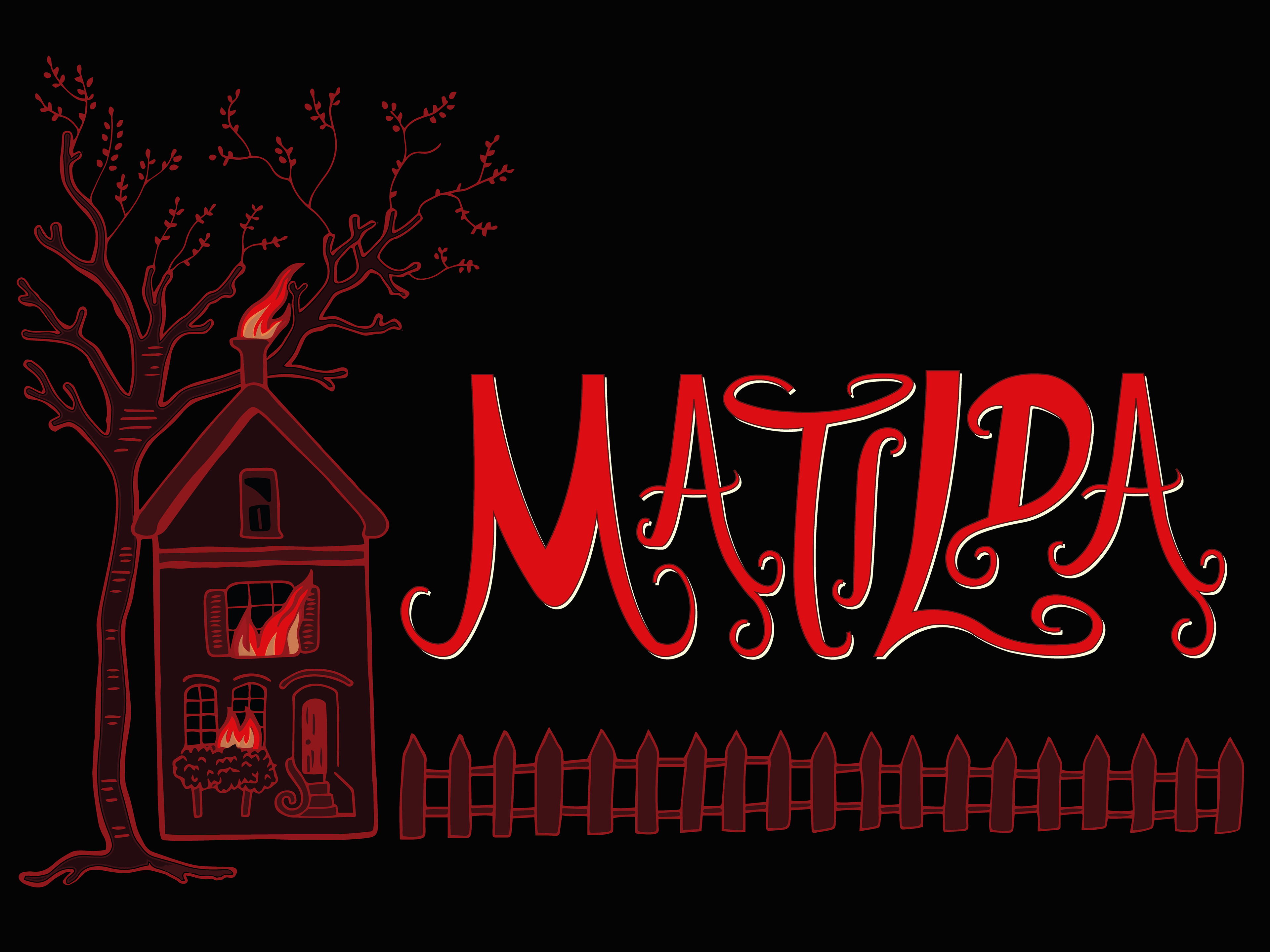
aS A GROUP WE DECIDED OUR inspiration will be 90's inspired thriller horror. We did not have a specific age for our target audience, but what will unite are target audience is their love for 90's thriller slasher films and aesthetics.
Exploration / development
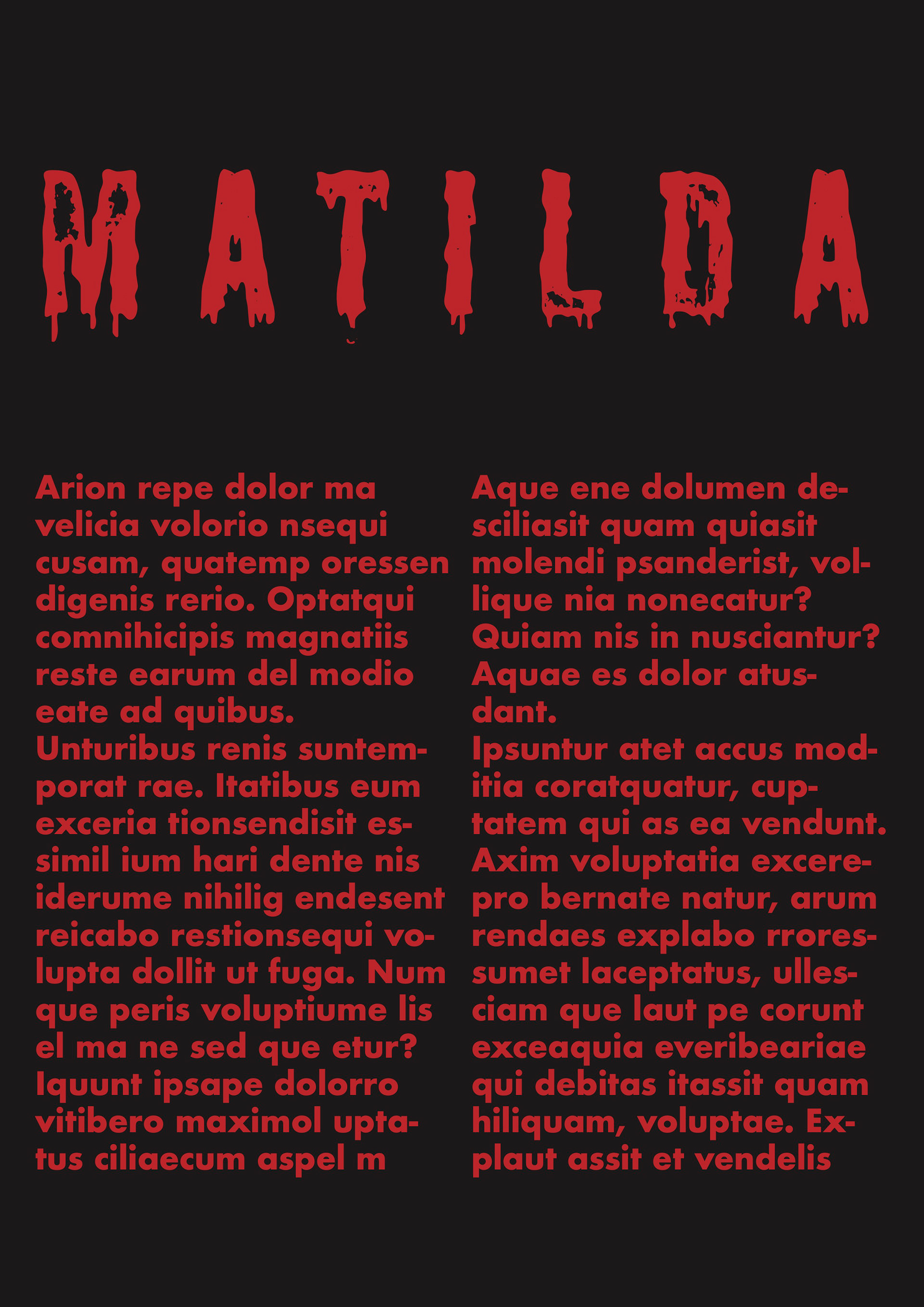
Before I had received any imagery or typographic drawings, I experiemtned alongside the art director with what we thought the outcomes would look like. Experimenting, with colour, typography and imagery, until we found the exact design theme we liked.
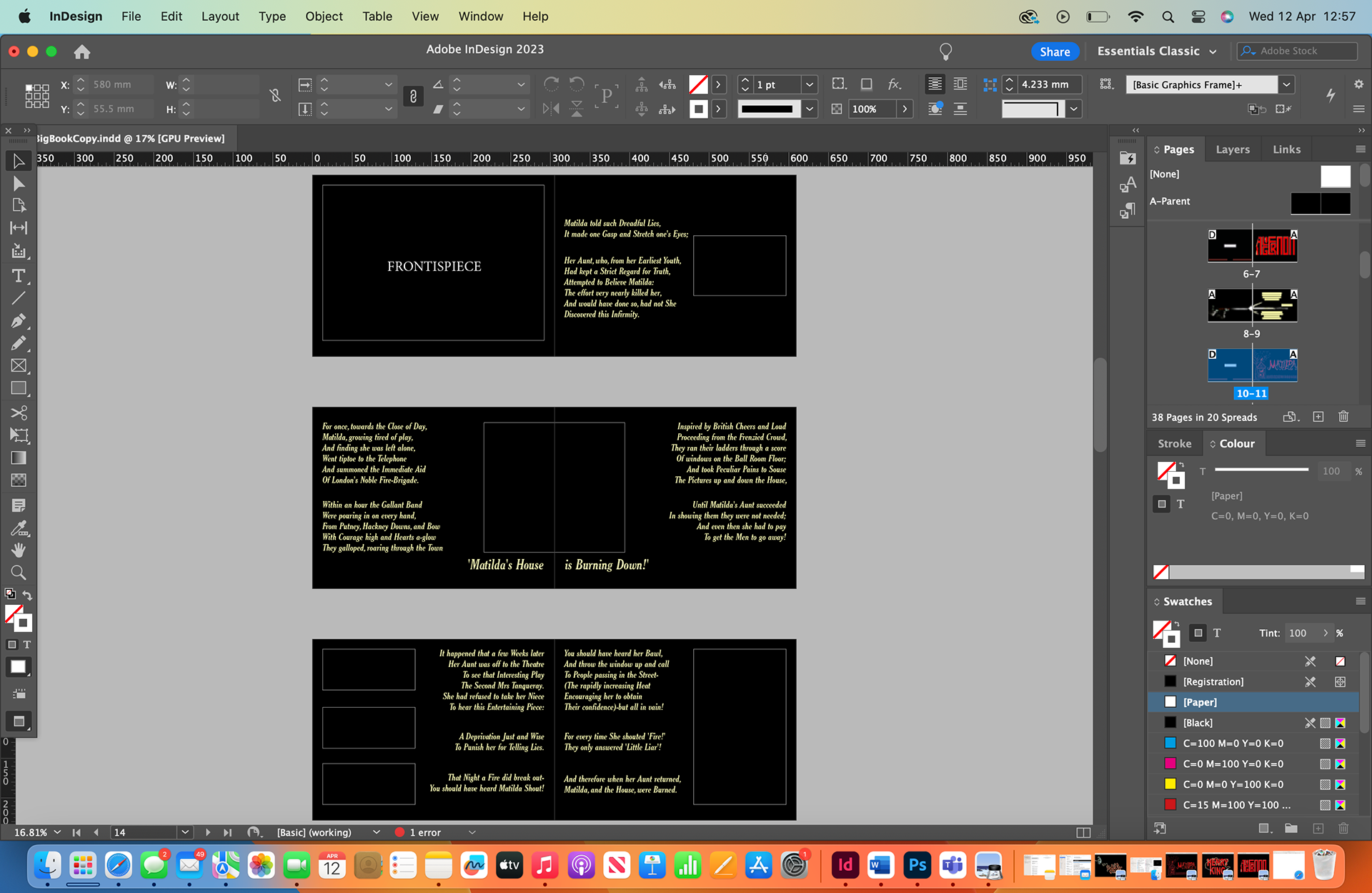
As we didn't change the text from the original story, I then used the typeface we chose and the colour scheme to position everything in the book, leaving spaces for imagery and headings that I did not have yet.
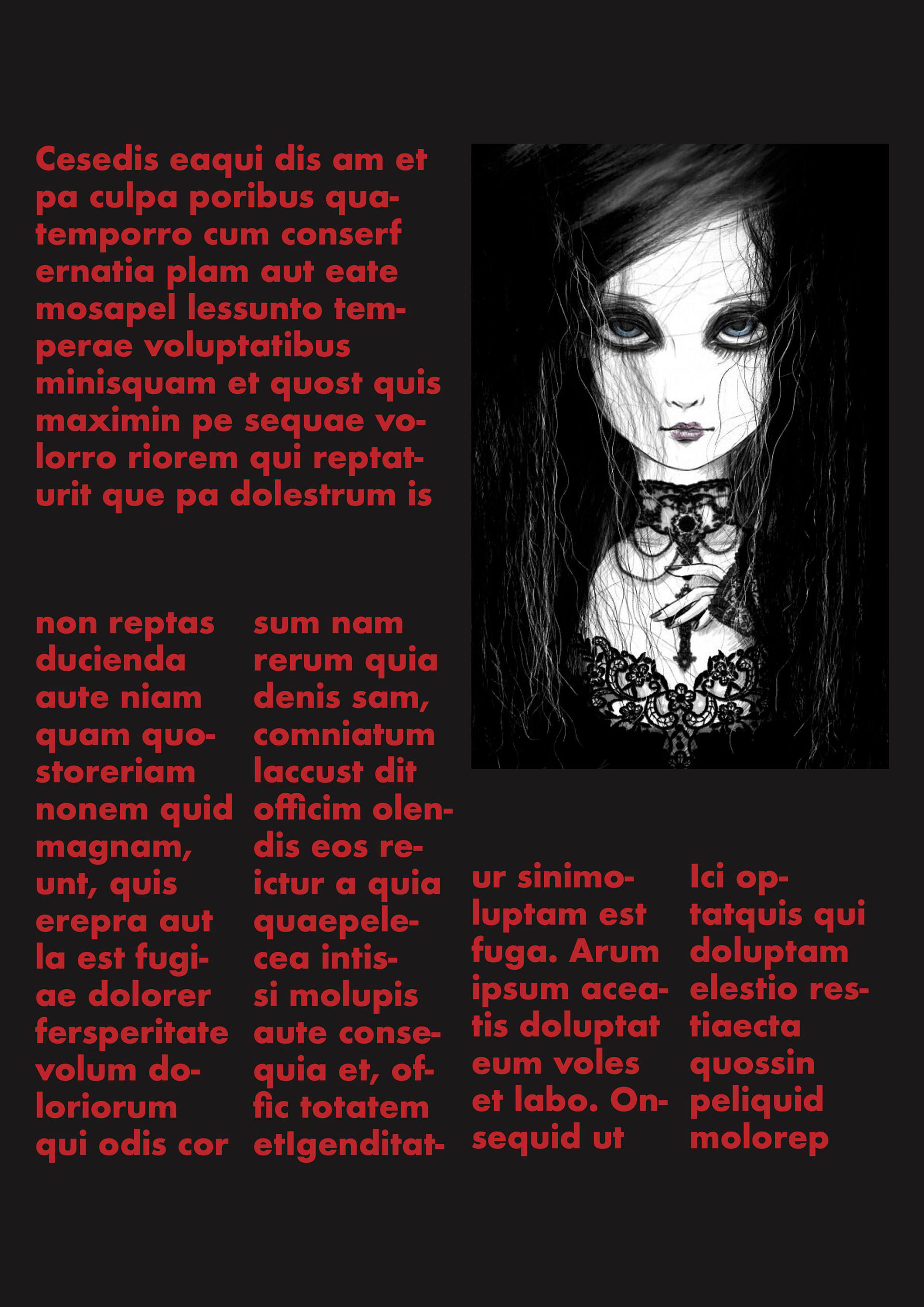
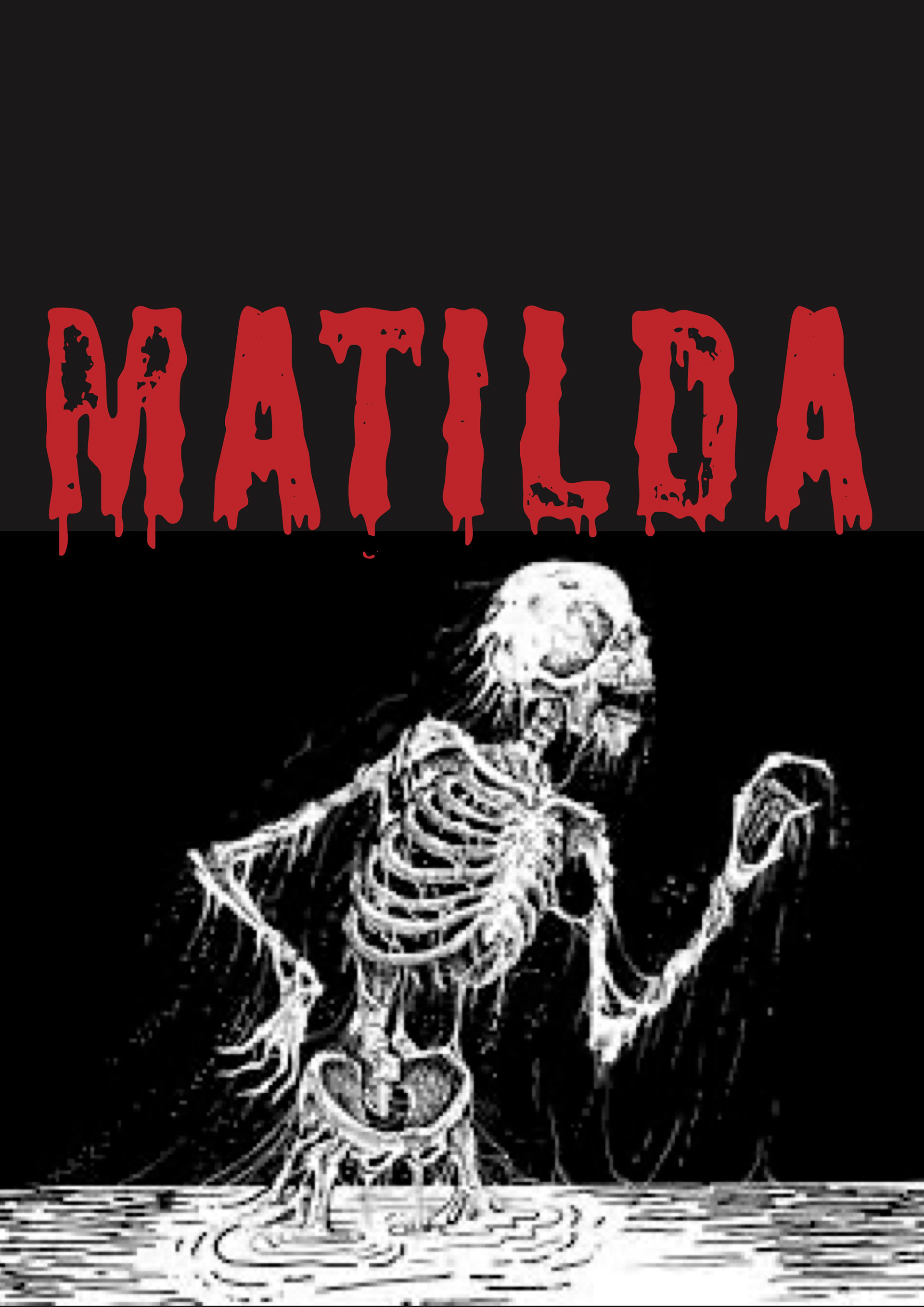
Final outcome in context
Book pages
